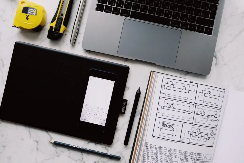
Architectural workspace showing design blueprints, laptop interface, and drawing instruments
Plate 01 — Spatial Grid & Proportion Study
Alboriessa Novia Limited — Hamilton, New Zealand

Crafting Digital Interfaces Through Discipline & Curiosity

Alboriessa Novia is an independent web design education practice established in Aotearoa New Zealand. We demystify contemporary digital design by teaching spatial structure, typography, responsive systems, and practical craftsmanship.

Section 02 / Foundations

Our Story & Educational Philosophy

Guiding Principle

"A website is not an ornament; it is a legible piece of architecture built out of rhythm, hierarchy, and quiet intent."

Pedagogical Standard Aotearoa NZ

A Clear Purpose in Contemporary Design

Alboriessa Novia was formed around a singular observation: the modern web is saturated with transient templates and noisy aesthetics, yet genuine understanding of underlying design principles remains rare. Aspiring designers and creative practitioners often encounter fragmented tutorials that emphasize rapid imitation over structural reasoning.

We operate as an educational studio rooted in New Zealand, dedicated to restoring reverence for the craft of layout. We treat the browser window as an architectural canvas where typographic scale, deliberate whitespace, and responsive constraints form a coherent visual language.

How We Approach Design Education

Our educational philosophy balances conceptual clarity with rigorous hands-on practice. We do not believe in mysterious talent or algorithmic shortcuts. Instead, we break design down into demonstrable disciplines:

01
Exposing the Grid Revealing baseline rhythms, column increments, and the visual logic that stabilizes complex layouts.
02
Typographic Integrity Teaching font pairing, measure, leading, and contrast as instruments of meaning and comfortable reading.
03
Adaptive Thinking Approaching mobile and desktop not as separate skins, but as continuous expressions of the same content system.
Section 03 / Ethos in Action

Core Values and How They Shape Learning

Our values are not abstract slogans on a wall. Each principle directly informs the design of our modules, practical briefs, critique methods, and exercise constraints.

Value 01

Clarity

We reject visual noise and gratuitous styling. Design must articulate its intent with immediate legibility and unforced elegance.

Applied in Learning:

Exercises require students to strip away extraneous decorative containers and prove hierarchy using only scale, spacing, and weight.

Value 02

Curiosity

Lasting design instincts grow from questioning standard defaults and investigating why certain interfaces feel calm while others exhaust the viewer.

Applied in Learning:

Learners deconstruct historical Swiss posters and editorial book layouts before translating their grid logic into responsive flex and CSS grids.

Value 03

Creativity

True digital creativity is not arbitrary decoration; it is inventive problem-solving within real technical and cognitive constraints.

Applied in Learning:

Students tackle briefs that restrict color palettes to two ink tones, forcing inventive compositions through asymmetric margins and negative space.

Value 04

Practical Learning

Theory without execution produces passive observers. We prioritize tangible design exercises that mirror authentic workflow challenges.

Applied in Learning:

Every module delivers an executable brief—such as auditing an ambiguous checkout flow or refactoring a cluttered institutional home view.

Value 05

Accessibility

An interface that excludes people is fundamentally defective. Accessible contrast, visible focus rings, and screen-reader awareness are mandatory foundations.

Applied in Learning:

Course work includes color contrast verifications against WCAG AA standards and structural keyboard navigation audits for all form controls.

Value 06

Continuous Improvement

Design is an iterative dialogue between intention and feedback. We train students to embrace constructive critique without personal defensiveness.

Applied in Learning:

Projects undergo structured version comparisons: initial sketch, structured wireframe, and final refined interface with rationale documentation.

Section 04 / Applied Craft

Design Contexts & Approach to Quality

Web design is not one single shape. The compositional demands of an editorial publication differ sharply from those of a regional small business or a service utility. At Alboriessa Novia, learners study how identical design tokens adapt across diverse real-world contexts.

01
Small Business & Craftsman Websites

Establishing immediate trust, physical locality, clear operating details, and friction-free inquiry channels without corporate pretence.

02
Editorial & Publication Layouts

Balancing generous typographic measure, thoughtful pull-quotes, multi-column reading rhythms, and calm image pacing.

03
Creative Portfolios & Studio Showcases

Letting selected work command attention through confident spacing, minimal chrome, and articulate case narratives.

04
Service & Digital Tool Interfaces

Managing dense data inputs, unmistakable state indicators, accessible forms, and unambiguous transactional clarity.

Teaching Standards & Quality Aotearoa NZ
Designer desk with notebook sketches, stylus, ruler, and digital device demonstrating careful interface composition

Our Four Quality Benchmarks

Semantic Rigor: Every layout must demonstrate clean HTML5 hierarchy before visual styling begins.
Accessible Defaults: 4.5:1 text contrast ratios and visible keyboard focus rings are tested on every assignment.
Device Realism: Designs are tested against fluid narrow viewports, preventing awkward line ribbons or clipped buttons.
Articulate Intent: Students must write a concise design rationale explaining why each typographic and layout decision was made.
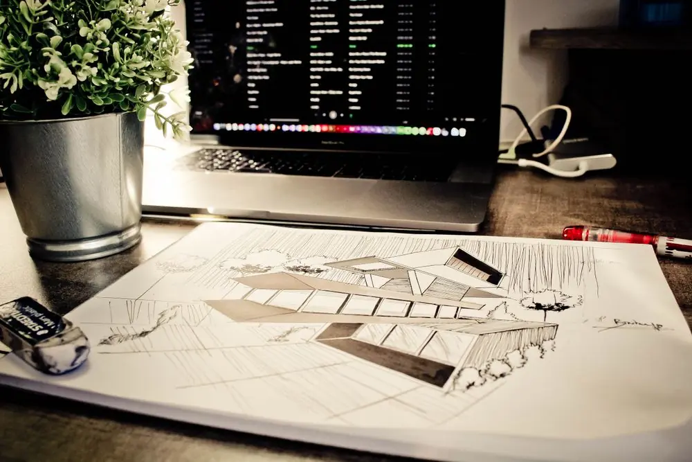
Overhead perspective of design plans, digital interface wireframes, and drafting tools on a desk
2026+ Design Horizons
Section 05 / Editorial Perspectives

The Future of Digital Design Belongs to the Disciplined

As automated generators and boilerplate templates become ubiquitous, mechanical software proficiency is no longer a moat. The designers who remain invaluable are those who comprehend semantic fundamentals, human perception, typographic nuance, and honest content hierarchy.

Pillar A

Adaptive Typographic Systems

Variable fonts and fluid viewport scales replace static pixel lockups, enabling reading experiences that effortlessly recalibrate between handheld screens and expansive studio monitors.

Pillar B

Inherent Accessibility

Accessibility is moving from a retrospective compliance audit to a primary creative constraint that produces higher contrast, cleaner DOM structures, and calmer visual hierarchies.

Pillar C

Restraint Over Clutter

Users increasingly reject aggressive conversion traps and sensory overload. Contemporary digital craft prioritizes decisive negative space, clear copy, and respectful interactions.

Have Questions About Our Course Offerings?

We welcome direct inquiries from aspiring learners, creative professionals, and educators across New Zealand. Reach our Hamilton studio for guidance on course content and learning paths.